

This week, prospective tariffs rattled markets — the first hit to the reflationary theme in months. Yields fell, equities fell significantly, and volatility spiked. But the business cycle remains expansionary, and growth and liquidity still dominate the macro backdrop.
For now, the Prometheus Multi-Strategy Program remains pro-cyclically allocated, looking through the volatility of Friday. We walk through the economic conditions driving these views.
Let's start with our business cycle gauge. Our systems aggregate a wide variety of fundamental economic data to create timely proprietary estimates for the current stages of the macro cycle. We share some of these gauges, starting with our signals for business cycle conditions:
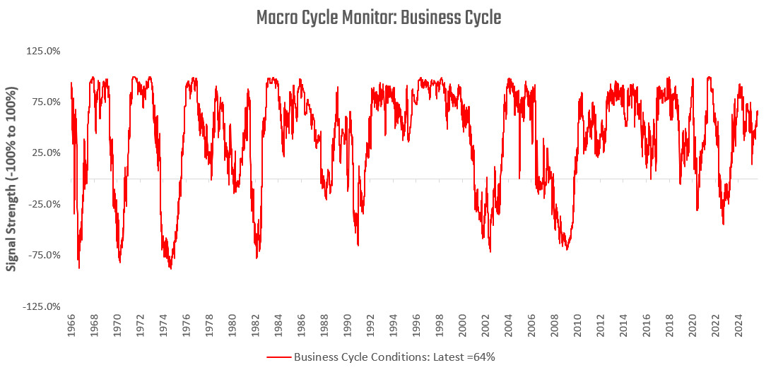
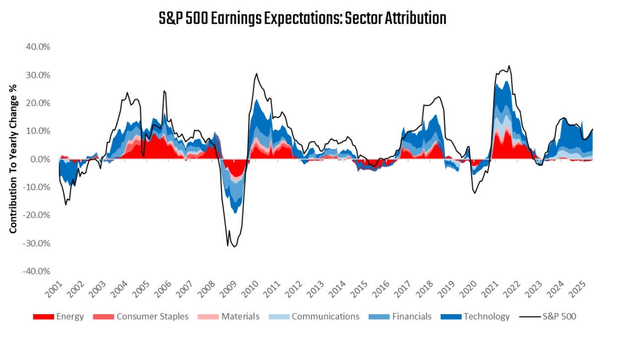
Our latest readings continue to show consistent signs of an expanding business cycle. These business cycle conditions continue to translate into growth in earnings expectations. We show the top three drivers in blue (Technology, Financials, Communications) and the bottom three in red (Energy, Consumer Staples, Materials):
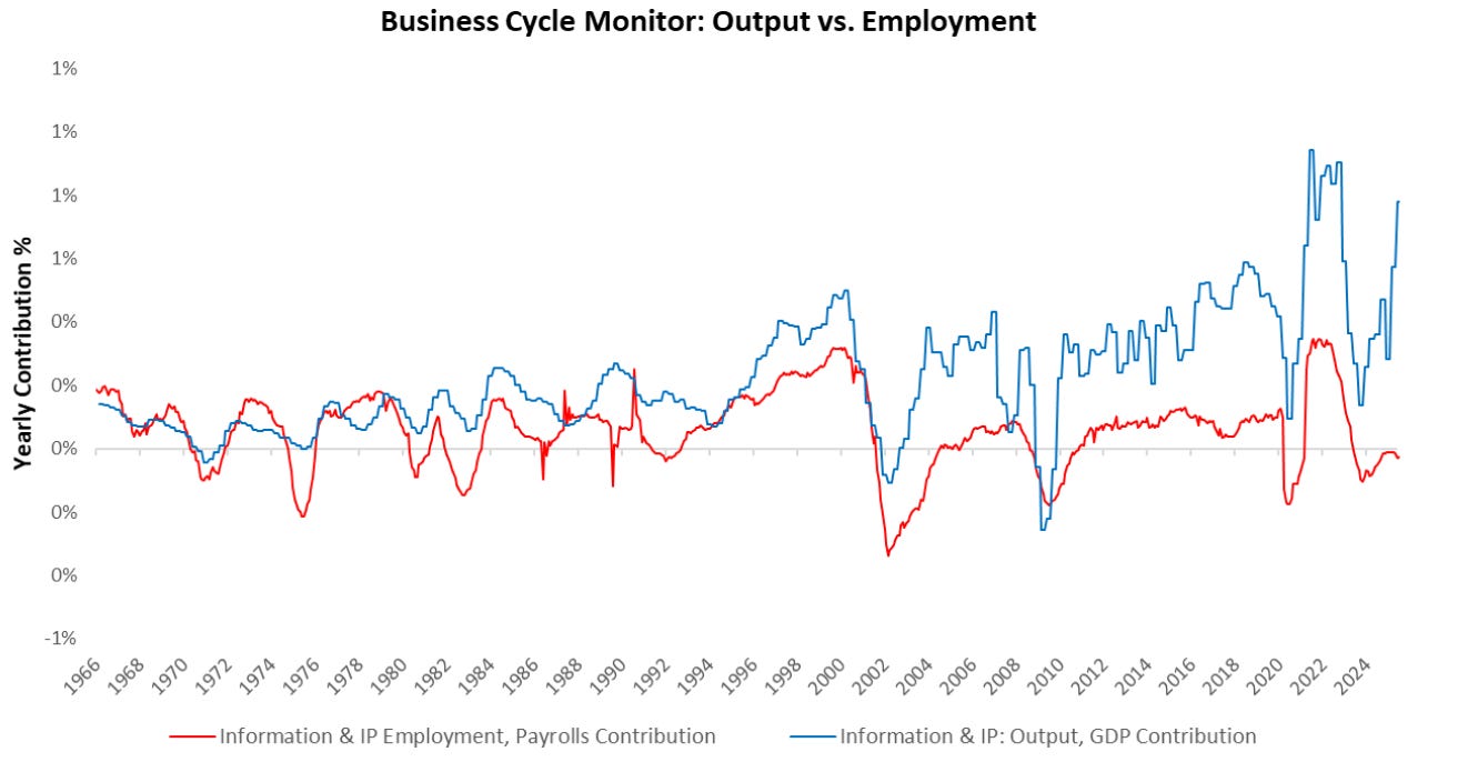
These conditions are consistent with income & spending dynamics in the economy. Technology firms continue to invest in the economy at a rapid pace:
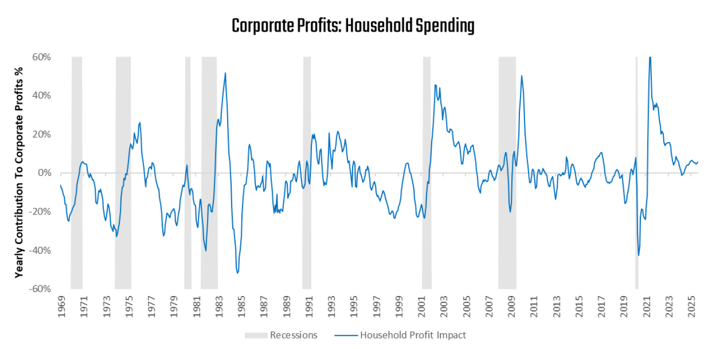
Meanwhile, households continue to contribute to the profits impulse as well:
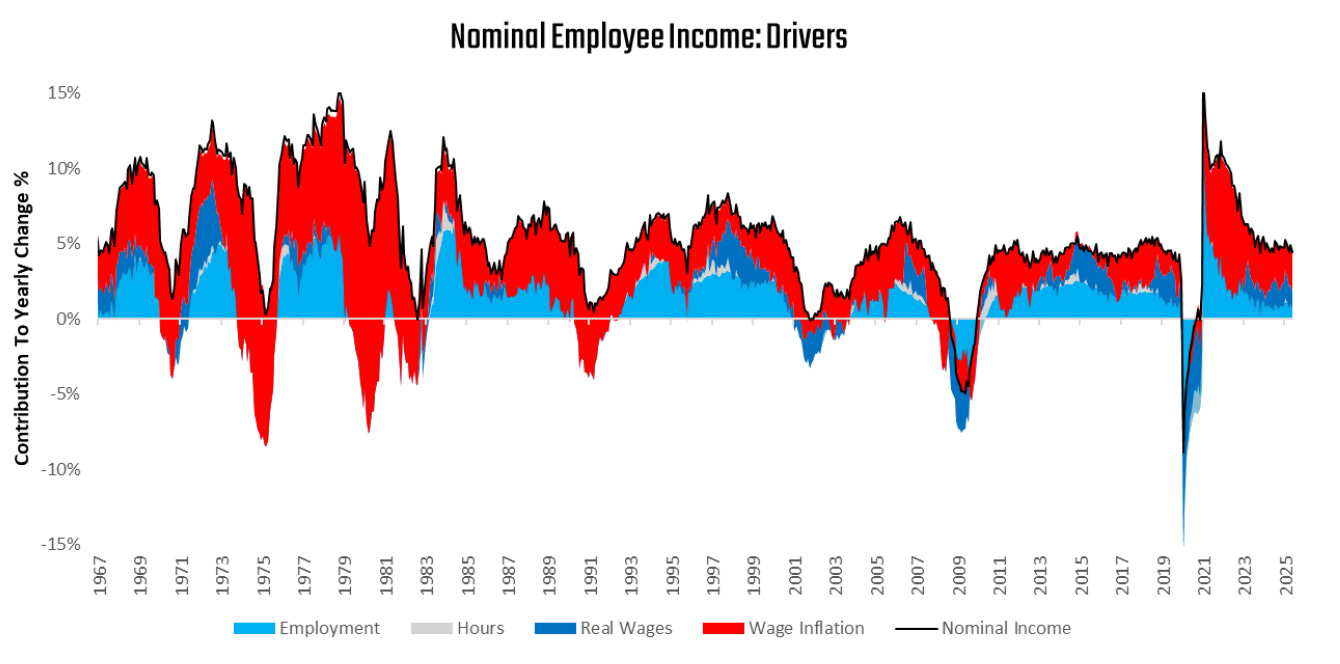
These conditions continue to support a business cycle expansion, which also continues to fuel wage inflation.
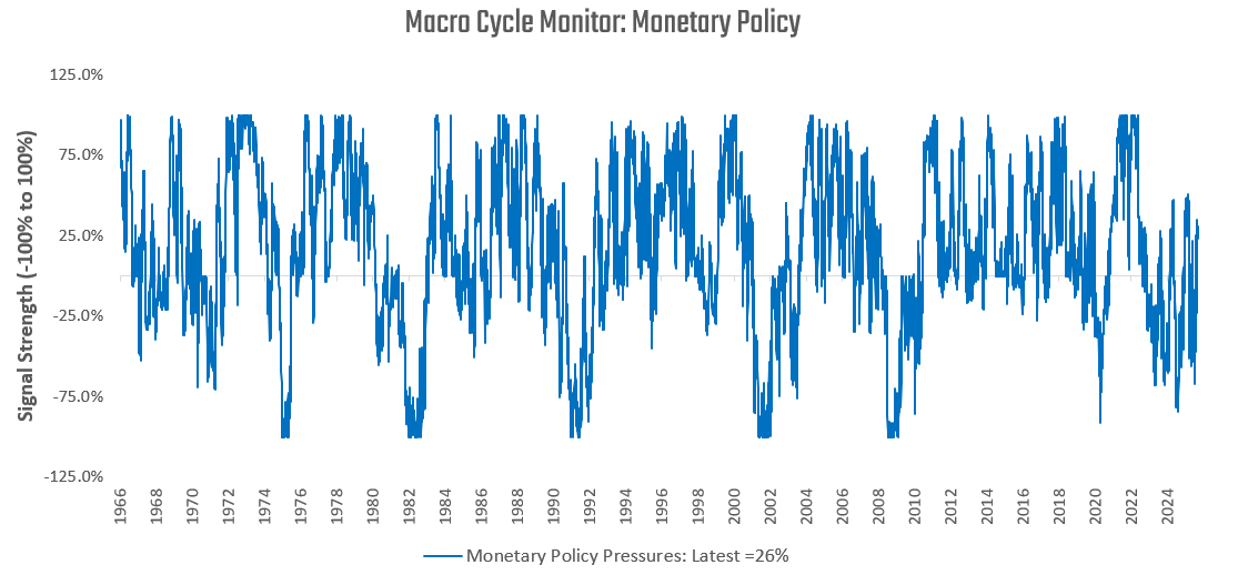
These dynamics continue to keep pressure on the Fed, with inflation remaining above its target. We show how our monetary policy gauge now shows incremental pressures to tighten monetary policy:
Given this backdrop, the Prometheus Multi-Strategy Program continues to be biased towards pro-cyclical exposures:
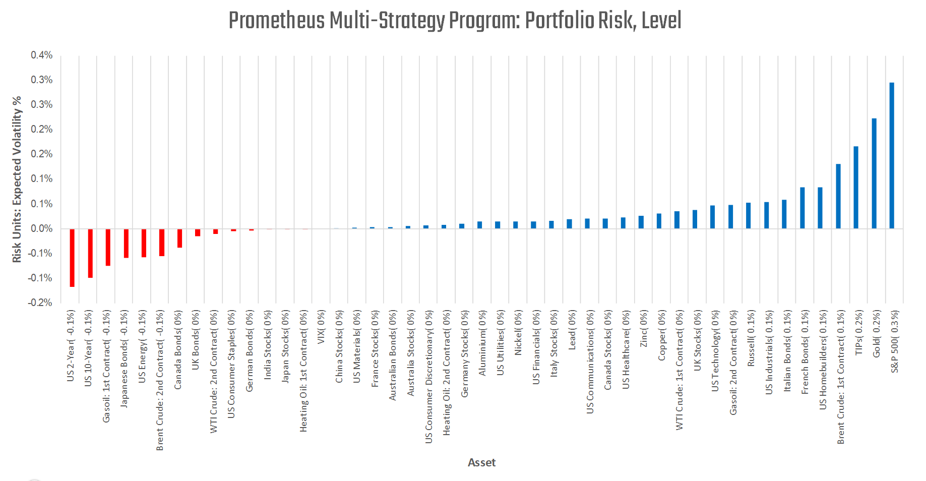
The program continues to maintain long global equities, industrial commodities, gold, and TIPs exposures, while remaining short US treasuries and JGBs. For now, the program continues to prefer a pro-cyclical bias, but the future is dynamic, and our systems will adapt as the data evolves. We will keep you updated as the outlook shifts.
Until next time.
Nice color, especially after Friday's volatility.
New subscriber: Can you please provide more clarity on how to turn your multi-strategy portfolio risk level chart into trades?
Risk unit: Expected volatility % is a subtle concept.
Does this chart mean: Go long on the blue bar categories? Go short on the red?
And if things were equallly weighted in your portfolio this is the amount of volatility you should expect from each category — in the postive direction (if blue) and in the negative direction (if red and you would want if you were short)?
Also, this chart is signals for what expected time-frame?